[Streamlit] Dashboard (2)구현
Dashboard 구현 :
앞서 Dashboard 를 설계했으니, streamlit 과 plotly 를 활용하여 Dashboard 를 실제로 구현해 보겠다.
1. streamlit 설치
- 가상환경 생성
- streamlit 배포 시 별도의 requirements.txt 를 넣어주어야 해당 라이브러리들이 streamlit share app 에 import 된다.
- 불필요한 라이브러리가 import 되는 것 방지하기 위해 별도의 가상 환경을 생성하는 것을 추천한다.
conda create -n streamlit python=3.8
conda activate streamlit
- 필요한 라이브러리 다운
- streamlit 은 pandas DataFrame 을 기준으로 시각화를 하기 때문에
pandas도 install 한다. - streamlit 에서 주로 사용할
plotly도 install 한다. - pip install streamlit 이 안 되면 python3 -m 을 붙이면 된다.
- streamlit 은 pandas DataFrame 을 기준으로 시각화를 하기 때문에
pip install streamlit
pip install pandas
pip install plotly
#python3 -m pip install streamlit
- streamlit 테스트
- 다음과 같은 명령어를 입력하면 아래 사진과 같이 8501 번 port 로 브라우저 창이 실행되는데 그러면 성공한 것이다.
streamlit hello
# python3 -m streamlit hello

- 파일 실행시키기
- 만약
streamlit.py라는 파일명에 코드를 작성했다면 아래와 같이 실행시켜주면 웹 페이지가 실행된다.
- 만약
streamlit run streamlit.py
2. 데이터 불러오기
- Redis Cluster 라이브러리 설치
pip install redis-py-cluster
- 필요한 모듈 import
from rediscluster import RedisCluster
import time
import streamlit as st
import pandas as pd
import plotly.express as px
import plotly.graph_objects as go
- Redis Cluster 와 연결
redis_nodes = [{'host': 'cluster ip', 'port': '6300'},
							 {'host': 'cluster ip', 'port': '6301'},
							 {'host': 'cluster ip', 'port': '6302'}]
redis_password = 'redis cluster 접근 비밀번호'

client = RedisCluster(startup_nodes=redis_nodes,
											password=redis_password,
											decode_responses=True)
- 불러올 데이터 기준
- Redis 에서 당일 로그 데이터만 조회하기 때문에 당일 날짜를 date 변수에 yyyyMMdd 형태로 저장한다.
- ex. 2022년 12월 20일 > 20221220
date = time.strftime('%Y%m%d', time.localtime(time.time()))
- 공통 집계 데이터 DataFrame 형태로 변환
- Redis 에 문자열 타입으로 저장된 숫자들을 숫자 type 으로 변환한다.
pd.to_numeric(errors='ignore')- 숫자 type 으로 변경 불가능한 열을 만나면 에러가 발생한다.
- 위 에러를 무시하도록 하는 속성이
errors='ignore'이다.
- Redis 에 문자열 타입으로 저장된 숫자들을 숫자 type 으로 변환한다.
# ------ common data
rows = list()
for key in client.scan_iter(match=f'common:{date}:*', count=100):
    temp, splitted = dict(), key.split(':')
    temp['date'], temp['hour'] = splitted[1], splitted[2]
    temp['user_gender'], temp['user_age'], temp['user_region'] = splitted[3], splitted[4], splitted[5]
    temp.update(client.hgetall(key))
    rows.append(temp)
df = pd.DataFrame(rows)
df = df.apply(pd.to_numeric, errors='ignore')
print(df.head())
date  hour user_gender  ...  ecopoint1_click save_ecopoint1  login
0  20221220    20           W  ...                2             20      0
1  20221220    20        none  ...                0              0      3
2  20221220    17           W  ...                2            100      1
3  20221220    15           W  ...                0              0      1
4  20221220    13           M  ...                2            100      2
- 무라벨 제품 검색 데이터 DataFrame 형태로 변환
# ------ search data
rows = list()
for key in client.scan_iter(match=f'search:{date}:*', count=100):
    temp, splitted = dict(), key.split(':')
    temp['date'], temp['user_gender'], temp['user_age'] = splitted[1], splitted[2], splitted[3]
    temp['search_word'], temp['count'] = splitted[4], int(client.hget(key, 'count'))
    rows.append(temp)
df2 = pd.DataFrame(rows)
df2 = df2.apply(pd.to_numeric, errors='ignore')
print(df2)
date user_gender  user_age search_word  count
0  20221220           M        20         사이다      2
1  20221220           W        30         사이다      1
2  20221220           M        20          홍차      1
3  20221220           W        30          생수      1
4  20221220           M        20         헛개수      1
3. 기본 설정
다음과 같이 페이지 제목과 아이콘을 설정한다.
# ------------ base
st.set_page_config(page_title="Ciaolabella Dashboard",
                   page_icon=":bar_chart:",
                   layout="wide")
st.write(f'# DATE : {date}')
4. 데이터 필터 생성 및 데이터 필터링
특정 시간대, 연령대, 성별, 지역 관련 데이터만 시각화해서 보여줄 수 있도록 필터 sidebar를 추가하고 df.query() 를 통해 선택한 특성에 맞는 데이터만 불러온다.
# ------------ data filter
st.sidebar.header("Filter")

hour = st.sidebar.multiselect(
    "Select Hour:",
    options=df['hour'].unique(),
    default=df['hour'].unique()
)
age = st.sidebar.multiselect(
    "Select Age:",
    options=df['user_age'].unique(),
    default=df['user_age'].unique()
)
gender = st.sidebar.multiselect(
    "Select Gender:",
    options=df['user_gender'].unique(),
    default=df['user_gender'].unique()
)
region = st.sidebar.multiselect(
    "Select Region:",
    options=df['user_region'].unique(),
    default=df['user_region'].unique()
)

selected = df.query(
    "hour == @hour & user_age == @age & user_gender == @gender & user_region == @region"
)
selected2 = df2.query(
    "user_age == @age & user_gender == @gender"
)
5. 레이아웃 생성
with tab:구문 안에서 해당하는 그래프들을with item:구문 안에 넣어주면 된다.
# ------------ make tabs
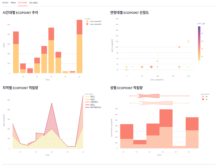
tab1, tab2, tab3, tab4 = st.tabs(["IN OUT", "MENU", "ECO POINT", "NO LABEL"])
# ------------ tab1 : login and logout
with tab1:
item1, item2, item3 = st.columns(3)
st.markdown("---")
item4, item5, item6 = st.columns([1,1,1])
# ------------ tab2 : menu click
with tab2:
item1, item2 = st.columns(2)
st.markdown('#### 메뉴 가수요 대비 실수요 (%)')
item3, item4 = st.columns(2)
item5, item6 = st.columns(2)
# ------------ tab3 : ecopoint service
with tab3:
item1, item2 = st.columns(2)
item3, item4 = st.columns(2)
# ------------ tab4 : nolabel service
with tab4:
item1, item2, item3 = st.columns(3)
- 필터링한 데이터를 직접 확인하고 csv 확장자로 다운로드하는 기능도 추가한다.
# ------------ data download
st.markdown("---")
st.markdown('#### 🔻 Common 데이터 확인 및 다운로드')
with st.expander("Click Here"):
    st.write(selected)
    st.download_button(
        label="Download .csv",
        data=selected.to_csv().encode('utf-8'),
        file_name=f'ciaolabella_common_{date}.csv',
        mime='text/csv'
    )
st.markdown('#### 🔻 Search 데이터 확인 및 다운로드')
with st.expander("Click Here"):
    st.write(selected2)
    st.download_button(
        label="Download .csv",
        data=selected2.to_csv().encode('utf-8'),
        file_name=f'ciaolabella_search_{date}.csv',
        mime='text/csv'
    )
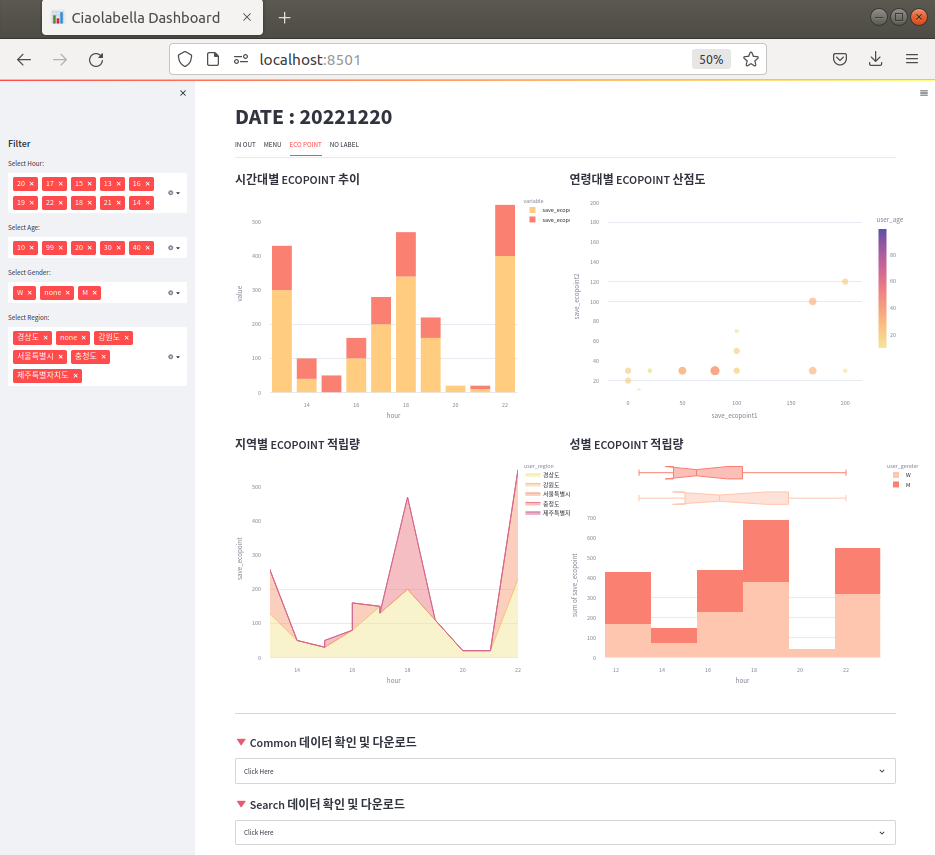
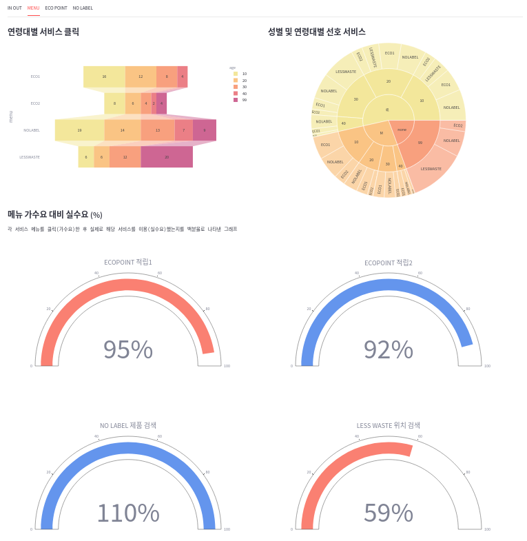
- 아래는 tab3 의 완성된 레이아웃이다.
6. 시각화
6.1. IN OUT
1) tab1
- 로그인 및 로그아웃 관련 시각화 tab1 은 다음과 같이 구현하였다.
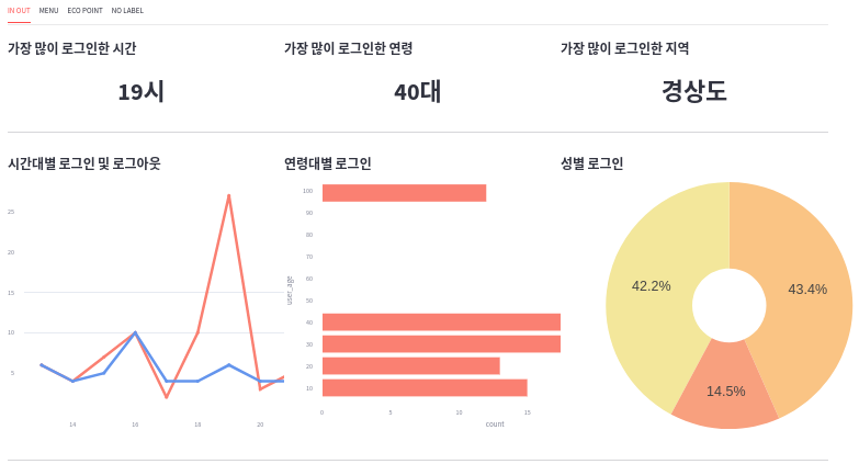
2) tab1 의 item1, item2, item3
- 가장 많이 로그인한 시간대 / 연령대 / 지역
most_login_hour = (selected.groupby("hour")["login"].sum().sort_values().index[-1])
most_login_age = (selected.groupby("user_age")["login"].sum().sort_values().index[-1])
most_login_region = (selected.groupby("user_region")["login"].sum().sort_values().index[-1])

with item1:
        st.markdown("#### 가장 많이 로그인한 시간")
        st.markdown(f"# <div style='text-align: center;'>{most_login_hour}시 </div>", unsafe_allow_html=True)
    with item2:
        st.markdown("#### 가장 많이 로그인한 연령")
        st.markdown(f"# <div style='text-align: center;'>{most_login_age}대 </div>", unsafe_allow_html=True)
    with item3:
        st.markdown("#### 가장 많이 로그인한 지역")
        st.markdown(f"# <div style='text-align: center;'>{most_login_region} </div>", unsafe_allow_html=True)
3) tab1 의 item4
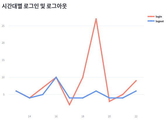
inout_by_hour = (
		selected.groupby(by=["hour"])[["login", "logout"]].sum().sort_index()
)
print(inout_by_hour.head(6))
---
				login  logout
hour
13        6       6
14        4       4
15        7       5
16       10      10
17        2       4
18       10       4
line1 = go.Figure()
line1.add_trace(go.Scatter(
    x=inout_by_hour.index,
    y=inout_by_hour["login"],
    name='<b>login</b>',
    line=dict(color='Salmon', width=5),
))
line1.add_trace(go.Scatter(
    x=inout_by_hour.index,
    y=inout_by_hour["logout"],
    name='<b>logout</b>',
    line=dict(color='CornflowerBlue', width=5),
))
line1.update_layout(margin=dict(t=0, l=10, r=10, b=0))
st.plotly_chart(line1)
4) tab1 의 item5
login_by_age = (
		selected.groupby(by=["user_age"])["login"].sum().sort_index()
)
print(login_by_age)
---
user_age
10    15
20    13
30    19
40    24
99    12
bar1 = px.bar(
            login_by_age,
            x=login_by_age.values,
            y=login_by_age.index,
            # color_discrete_sequence=['#0083B8'] * len(eco1_by_hour),
            color_discrete_sequence=["Salmon"],
            template='plotly_white',
            orientation='h',
            labels={'x': 'count'}
        )
bar1.update_layout(margin=dict(t=0, l=0, r=0, b=0))
st.plotly_chart(bar1)
5) tab1 의 item6
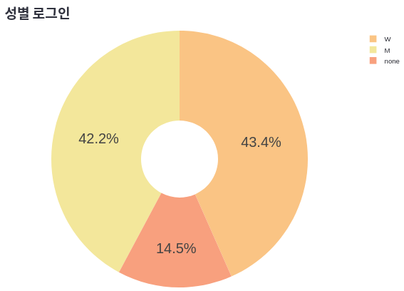
login_by_gender = (
    selected.groupby(by=["user_gender"])["login"].sum()
)
print(login_by_gender)
---
user_gender
M       35
W       36
none    12
pie1 = go.Figure(go.Pie(
    labels=login_by_gender.index,
    values=login_by_gender.values,
    hole=.3,
    marker_colors=px.colors.sequential.Sunset
))
pie1.update_layout(
    margin=dict(t=0, l=0, r=0, b=0),
    font = dict(family="Arial", size=25, color="#000000")
)
st.plotly_chart(pie1)
6.2. MENU
1) tab2
- 메뉴(서비스) 이용 관련 시각화 tab2 은 다음과 같이 구현하였다.
2) tab2 의 item1
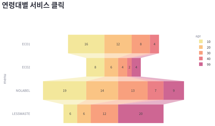
menu_by_age = (
    selected[["user_age", "menu_eco1", "menu_eco2", "menu_nolabel", "menu_lesswaste"]].groupby(
        by=["user_age"]).sum()
).stack().reset_index()
menu_by_age.columns = ["age", "menu", "click"]
menu_by_age["menu"] = menu_by_age["menu"].apply(lambda x: x.split('_')[1].upper())
print(menu_by_age.head(10))
---
age       menu  click
0    10       ECO1     16
1    10       ECO2      8
2    10    NOLABEL     19
3    10  LESSWASTE      6
4    20       ECO1     12
5    20       ECO2      6
6    20    NOLABEL     14
7    20  LESSWASTE      6
8    30       ECO1      8
9    30       ECO2      4
funnel1 = px.funnel(
            menu_by_age,
            x='click',
            y='menu',
            color='age',
            color_discrete_sequence=px.colors.sequential.Sunset
        )
st.plotly_chart(funnel1)
3) tab2 의 item2
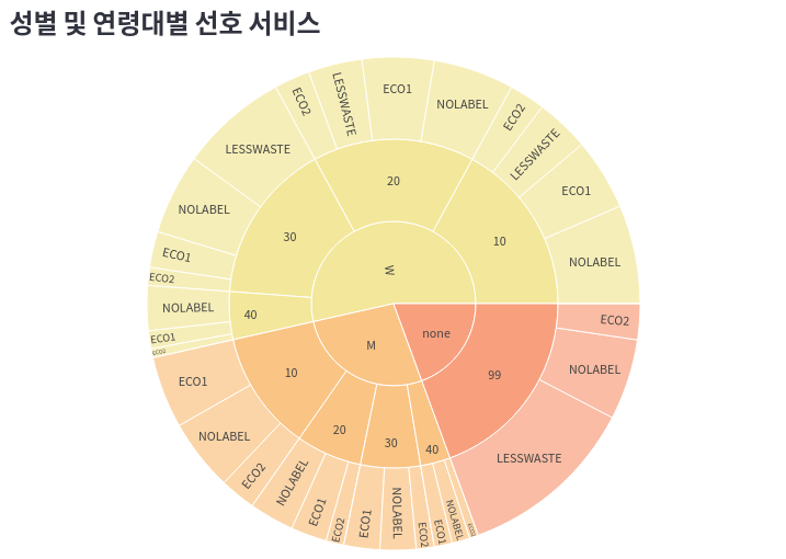
menu_by_gender_age = (
    selected[["user_gender", "user_age", "menu_eco1", "menu_eco2", "menu_nolabel", "menu_lesswaste"]]\
		.groupby(by=["user_gender", "user_age"]).sum()
).stack().reset_index()
menu_by_gender_age.columns = ["gender", "age", "menu", "click"]
menu_by_gender_age["menu"] = menu_by_gender_age["menu"]\
														.apply(lambda x: x.split('_')[1].upper())
print(menu_by_gender_age.head())
---
gender  age       menu  click
0       M   10       ECO1      8
1       M   10       ECO2      4
2       M   10    NOLABEL      8
3       M   10  LESSWASTE      0
4       M   20       ECO1      4
...
16      W   10       ECO1      8
17      W   10       ECO2      4
18      W   10    NOLABEL     11
19      W   10  LESSWASTE      6
20      W   20       ECO1      8
...
31      W   40  LESSWASTE      0
32   none   99       ECO1      0
33   none   99       ECO2      4
34   none   99    NOLABEL      9
35   none   99  LESSWASTE     20
sunburst1 = px.sunburst(
    menu_by_gender_age,
    path=["gender", "age", "menu"],
    values="click",
    color_discrete_sequence=px.colors.sequential.Sunset
)
sunburst1.update_layout(margin=dict(t=0, l=0, r=0, b=0))
st.plotly_chart(sunburst1)
4) tab2 의 item3
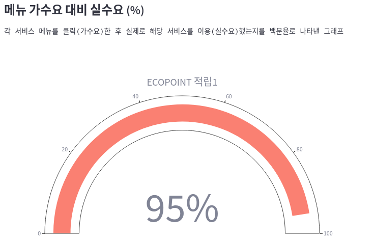
eco1_demand = selected['ecopoint1_click'].sum() / selected['menu_eco1'].sum()
print(eco1_demand)
---
0.95
gauge1 = go.Figure(go.Indicator(
    title={"text": "ECOPOINT 적립1"},
    value=round(eco1_demand * 100),
    number={"suffix": "%"},
    mode="gauge+number",
    gauge={
        "axis": {"range": [None, 100]},
        "bar": {"color": "Salmon"}
    }
))
st.plotly_chart(gauge1)
5) tab2 의 item4, item5, item6
- 나머지 item 도 item3 과 같은 코드에 eco1_demand 변수 대신 다음과 같은 변수들로 변경해서 넣어주면 된다.
eco2_demand = selected['ecopoint2_click'].sum() / selected['menu_eco2'].sum()
nolabel_demand = selected['nolabel_click'].sum() / selected['menu_nolabel'].sum()
lesswaste_demand = selected['lesswaste_click'].sum() / selected['menu_lesswaste'].sum()
6.3. ECOPOINT
1) tab3
- ECOPOINT 적립 관련 시각화 tab3 은 다음과 같이 구현하였다.
2) tab3 의 item1
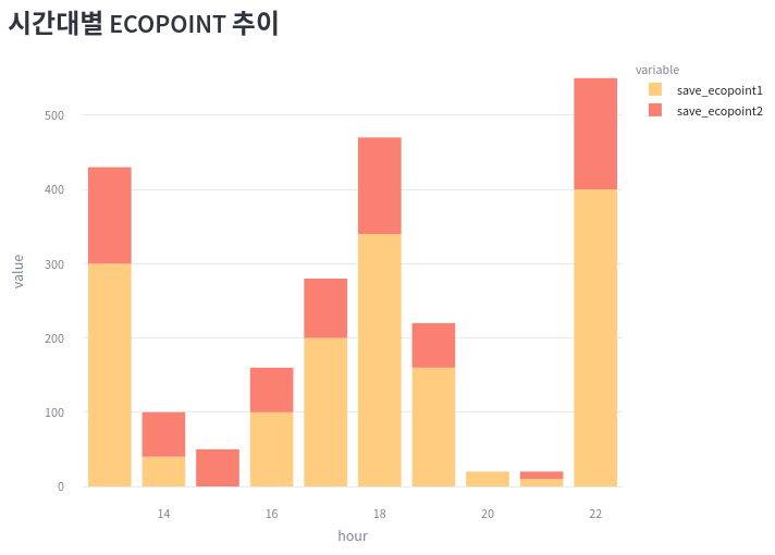
ecopoint_by_hour = selected[["hour", "save_ecopoint1", "save_ecopoint2"]]\
									.groupby(by=["hour"]).sum()
print(ecopoint_by_hour.head())
---
save_ecopoint1  save_ecopoint2
hour
13               300             130
14                40              60
15                 0              50
16               100              60
17               200              80
bar2 = px.bar(
    ecopoint_by_hour,
    x=ecopoint_by_hour.index,
    y=["save_ecopoint1", "save_ecopoint2"],
    color_discrete_sequence=["#FFCC80", "Salmon"],
)
bar2.update_layout(margin=dict(t=0, l=0, r=0, b=0))
st.plotly_chart(bar2)
3) tab3 의 item2
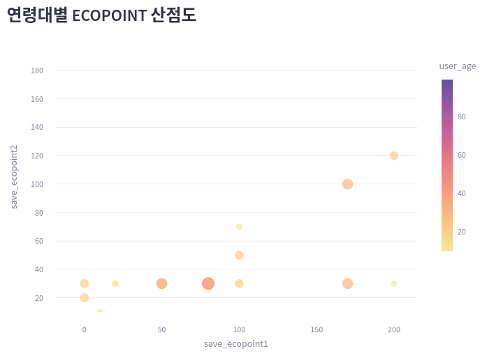
ecopoint_by_age = selected[["user_age", "save_ecopoint1", "save_ecopoint2"]]
ecopoint_by_age["user_age"] = ecopoint_by_age["user_age"].astype("int")
print(ecopoint_by_age.head(6))
---
user_age  save_ecopoint1  save_ecopoint2
0         10              20               0
1         99               0               0
2         20             100              50
3         30               0               0
4         10             100              30
5         20               0              30
bubble1 = px.scatter(
    selected[["user_age", "save_ecopoint1", "save_ecopoint2"]],
    x="save_ecopoint1",
    y="save_ecopoint2",
    size="user_age",
    color="user_age",
    color_continuous_scale=px.colors.sequential.Sunset
)
bubble1.update_layout(yaxis_range=[10, 200], margin=dict(t=0, l=0, r=0, b=0))
st.plotly_chart(bubble1)
4) tab3 의 item3
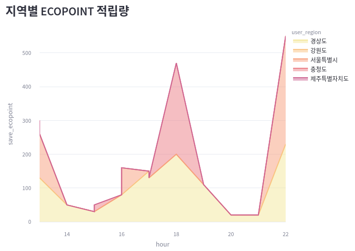
ecopoint_by_region = selected[selected["user_gender"]!="none"]
ecopoint_by_region["save_ecopoint"] = ecopoint_by_region["save_ecopoint1"] + ecopoint_by_region["save_ecopoint2"]
print(ecopoint_by_region.head())
---
date  hour user_gender  ...  save_ecopoint1 login  save_ecopoint
0   20221220    20           W  ...              20     0             20
2   20221220    17           W  ...             100     1            150
3   20221220    15           W  ...               0     1              0
4   20221220    13           M  ...             100     2            130
5   20221220    15           M  ...               0     2             30
area1 = px.area(
    ecopoint_by_region,
    x="hour",
    y="save_ecopoint",
    color="user_region",
    color_discrete_sequence=px.colors.sequential.Sunset,
)
area1.update_layout(margin=dict(t=0, l=0, r=0, b=0))
st.plotly_chart(area1)
5) tab3 의 item4
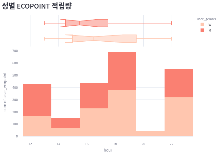
ecopoint_by_gender = ecopoint_by_region
hist1 = px.histogram(
    ecopoint_by_gender,
    x="hour",
    y="save_ecopoint",
    color="user_gender",
    marginal="box",
    color_discrete_sequence=["#FFC6AF", "Salmon"],
    hover_data=selected.columns
)
hist1.update_layout(margin=dict(t=0, l=0, r=0, b=0))
st.plotly_chart(hist1)
6.4. NO LABEL
1) tab4
- 무라벨 제품 검색 관련 시각화 tab4 은 다음과 같이 구현하였다.
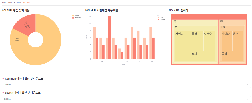
2) tab4 의 item1
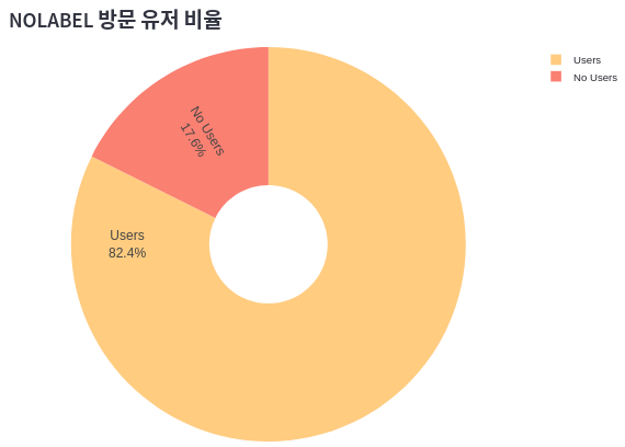
condition = selected['user_gender'] == 'none'
nouser = sum(selected.loc[condition].nolabel_click)
user = sum(selected.loc[~condition].nolabel_click)
print(nouser)
print(user)
---
12
56
pie2 = go.Figure(go.Pie(
    labels=["Users", "No Users"],
    values=[user, nouser],
    textinfo='label+percent',
    insidetextorientation='radial',
    hole=.3,
    marker_colors=["#FFCC80", "Salmon"],
    ))
pie2.update_layout(
    margin=dict(t=0, l=0, r=0, b=0),
    font=dict(family="Arial", size=15, color="#000000")
)
st.plotly_chart(pie2)
3) tab4 의 item2
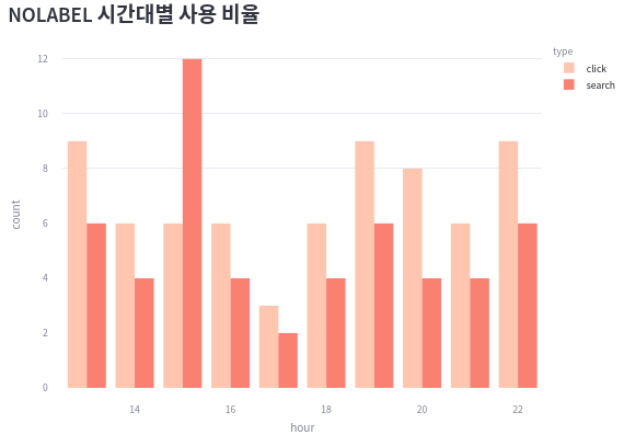
click_search = (
    selected[["hour", "nolabel_click", "nolabel_search"]].groupby(by=["hour"]).sum()
).stack().reset_index()
click_search.columns = ["hour", "type", "count"]
click_search["type"] = click_search["type"].apply(lambda x: x.split("_")[1])
print(click_search)
---
hour    type  count
0     13   click      9
1     13  search      6
2     14   click      6
3     14  search      4
4     15   click      6
5     15  search     12
bar3 = px.bar(
    click_search,
    x="hour",
    y="count",
    color="type",
    color_discrete_sequence=["#FFC6AF", "Salmon"],
    barmode="group"
)
bar3.update_layout(margin=dict(t=0, l=0, r=0, b=0))
st.plotly_chart(bar3)
4) tab4 의 item3
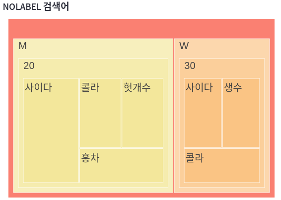
print(selected2)
---
date user_gender  user_age search_word  count
0  20221220           M        20         사이다      2
1  20221220           W        30         사이다      1
2  20221220           M        20          홍차      1
3  20221220           W        30          생수      1
4  20221220           M        20         헛개수      1
5  20221220           W        30          콜라      1
6  20221220           M        20          콜라      1
tree1 = px.treemap(
    selected2,
    path=['user_gender', 'user_age', 'search_word'],
    values='count',
    color_discrete_sequence=px.colors.sequential.Sunset,
)
tree1.update_traces(
    root_color="Salmon"
)
tree1.update_layout(
    margin=dict(t=0, l=15, r=15, b=0),
    font=dict(family="Arial", size=25, color="#000000")
)
st.plotly_chart(tree1)
REFERENCES
- plotly 차트 참고
- plotly 색상 참고
- color list 참고
- 이모티콘 참고